Introduction
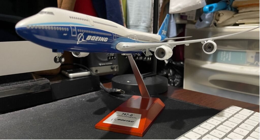
As an aircraft enthusiast, I’ve always followed the mini technological advancements in aircraft production as produced by the Boeing company. This past August 24, I had the opportunity to visit the Boeing Museum located in Seattle Washington. It is for this reason why I choose their company logo for this project and share my photo of the new 747-8. It features the newest iteration of the Boeing company’s logo on the left side. Having said this, how did this company begin its journey and develop its internationally known logo?
Origin of the Boeing Company
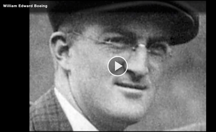
The company had its genesis in 1916 in Seattle Washington by its founder Mr. William Boeing. According to the Encyclopedia Britannica, “the Boeing Company is the world’s largest manufacturer of commercial jet transports and is the world’s leading producer of military, aircraft, helicopters, space vehicles and missiles.” Contributing to its global position in the industry is its acquisition of the Rockwell International Corporation and its 1997 merger with the McDonnell Douglas Corporation. These acquisitions and mergers were influences on the official logo which we see today shown on the jet in Fig 1 above.
How did the logos’ design change over time?
In describing the iterations of the company’s logo over time, a chronological approach will be used as much as possible throughout the duration of this paper. However, the company on a whole historically has been very deliberate in its selection of the elements used in the creation of the many iterations of its logo over the decades. According to their posted article dated July 14, 2021, the online blog 1000logos.net reports that the Boeing Company’s logo has gone through at least 4 redesigns in its history. It is conceivable that more than four design changes were in fact made given the historical record of iterations (seen in Figure 3 below).
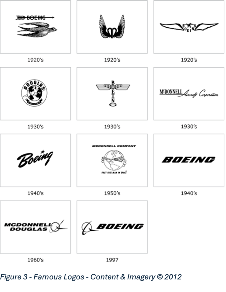
The reality is that the Boeing company has gone to great lengths to document the history of its logo. What a beautiful history it is! Michael Lombardi FRAeS (Fellowship of the Royal Aeronautics Society) and current Senior Historian at the Boeing Company based in Seattle is a direct contributor of the historical data provided in this research paper (see Pdf link in citations). The historical records report that in 1918 the “first logo was a detailed drawing of a bird flying below the name Boeing which was pierced through by an arrow (Fig. 3).” However, the company was challenged in court with a trademark infringement lawsuit from the PIERCE luxury automobile company in New York. That company’s logo (Fig. 4)
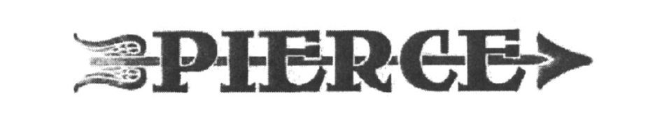
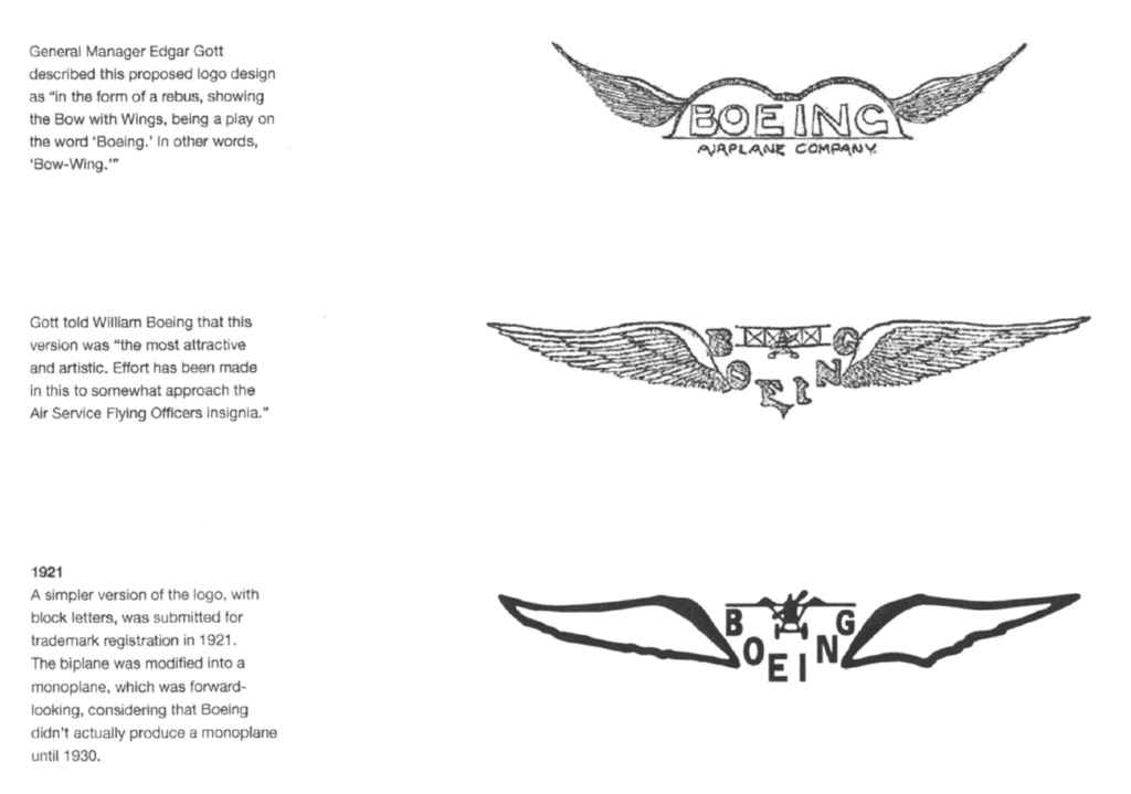
also used the company name pierced through with an arrow. Boeing had to drop this aspect from its logo. At that time the company was called Boeing Airplane Company and by 1921 it was clear that they needed a new official logo. General manager Edgar Gott in his January 13 memo (see pdf in citations) of that year wrote to William Boeing presenting three possible designs for a new company logo. All three designs Incorporated versions of the Boeing name surrounded by wings are seen in Fig. 5 below. Design 2 of the three was chosen.
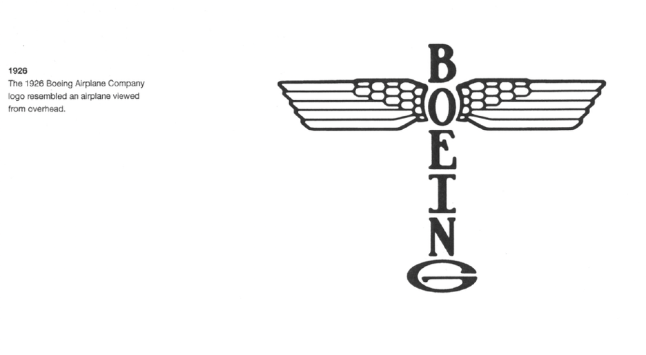
According to Boeing Company records, five years after that Edgar Gott memo the new design iteration was proposed and adopted in 1926. The logo was both designed and proposed by Boeing Chief Engineer C.N Montieth and artist Rogger Sult respectively. “Sult created a logo in the shape of a (Totem) pole echoing the traditional arts of the pacific northwest Indian tribes. The letters of the company name formed the vertical pole and the two birdwings extended from the “O”. The “G” was widened to resemble the horizontal stabilizer of an airplane so that the entire shape is similar to that of an airplane in plan view (viewed from above).” Michael Lumbardy in the archival records is noted as describing this particular iteration of the logo as a defining event in the company’s public branding and corporate identity. He writes, “This was one of the first disciplined uses of corporate identity in the history of Boeing. The Boeing Airplane Company logo is placed inside a double circle, and between the outer circle was the name of the company or subsidiary.” Images are very powerful when they represent the goals and purposes of a group of people sharing a common set of values and objectives. For these reasons, this particular iteration of the logo was extremely popular within the Boeing company itself. It was used on Leatherheads, signage, pins, the sides of Aircraft as well as on embroidered patches on the uniforms of company employees. The companies staff lovingly called it, “the bug.”
CLICK TO CONTINUE READING PART 2…