The Design History Of The Boeing Company’s Logo continues. At the time, the general manager PHILLIP Johnson suggested that the 1921 logo needed to be replaced and that the company be represented by a single image. On November 26th, 1926, he wrote a memo to William bowling expressing his preference for the use of the new design on the company’s letterhead. To emphasize his point, in attaching the new design to the memo which is presented on the usual company letterhead, he was deliberate in drawing an X through the 1921 logo on the very top of the page as he presented the new design.
By the arrival of the 1930s, America and the world at large were undergoing a major transformation. The company had to adapt and grow in the areas in which it was able to dominate the industry. The company is now called the United Aircraft and Transport Company. This company included aircraft manufacturers, engine and propeller manufacturers, and facilities that train the flight and maintenance personnel. A key part of the company’s business was mail delivery across the United States. It is conceivable that the US Congress became nervous of a company of Boeing’s magnitude having such levels of dominance in the US marketplace.
It’s past the 1934 Airmail Act. Archival records report that to comply with the regulations the company had to split itself into three entities. “The first was United Airlines, secondly United Aircraft (later United Technologies, the parent company of aircraft engine manufacturer Pratt and Whitney), and last, the Boeing Airplane Company.” Apart from triggering the departure of William Boeing from his own company, it triggered a search for a redefining of the company’s logo once again.
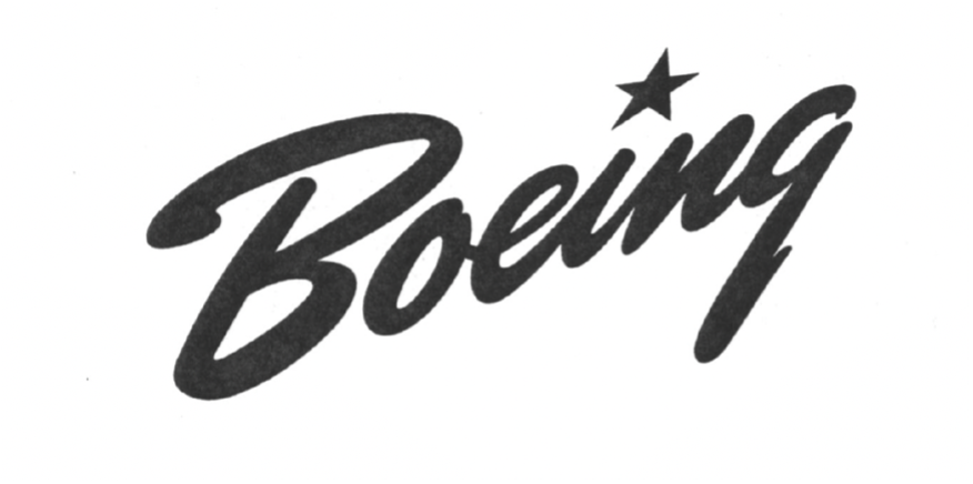
In 1937 Boeing’s designers began experimenting with a brush script typeface that was tilted at an angle to simulate a rising aircraft. It had a star over the “I” to signify the US Air Force star. The script was already popular in use across the United States and was used by American iconic sports teams such as the Brooklyn Dodgers and the New York Yankees on their team jerseys seen in Fig 7 below. They even experimented briefly with the serif typeface Beton. By 1940 the star was replaced with a dot with the launching of its new Boeing Stratocruiser aircraft.
Company records suggest that one of the design hindrances was that the Boeing logo has faced from its inception what is its ability to be used in all areas of the company’s activity as well as its user-friendliness in being applied on all types of materials such as plastic, wood, metal, company letterheads and on the sides of Aircraft. It still needed to be legible, photogenic, versatile, dignified in its originality and it’s a representation of comfort, luxury, speed, and dependability. These were the ideals that framed the proposal submitted by Boeing artists Keith Kinsman and Bob Lally in 1947, for a new logo that would take the Boeing company into the jet age with has just begun. Their proposal was 10 pages in length and included sketches, and paint studies which ultimately culminated in them creating a new typeface unique to the company. It was a bold, oblique, sans serif-type face which they eventually gave the name Stratotype (Fig 8). This design was an immense success across the entire company and globally. Many design systems that required the use of a logo where deliberately designed with the stratotype logo design in mind.
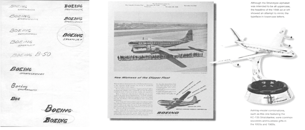
Figure 8 Boeing Stratotype original Design Sketches by Keith Kinsman and Bob Lally in 1947. – Boeing Stratotype
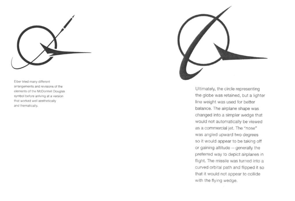
Many design systems that required the use of a logo were deliberately designed with the stratotype logo design in mind. This design was so successful it survived up until 1996 when American corporate logo designer Rick Eiber what is contracted to develop a series of design studies that would lead to a modernized version of the logo. It’s so happened that concurrent to this, Company executives had successfully negotiated a merge with McDonald Douglas. The designer seized upon this opportunity and they proceeded to merge the logos of these two American iconic companies. 40 different iterations of potential designs were proposed before a conclusion was reached shown in figure 9 below.
What does the current logo mean?
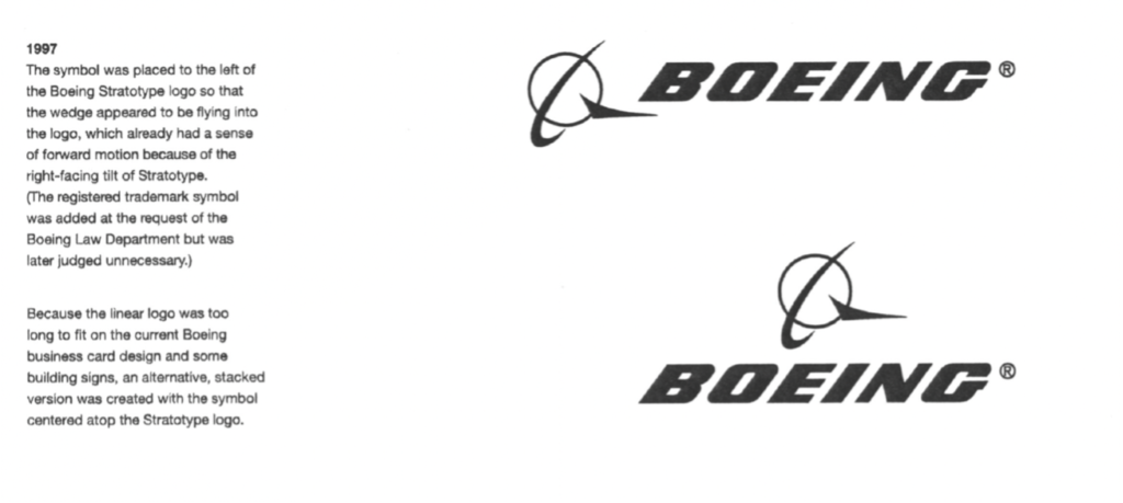
In 1997, Rick Eiber completed his final design of the company’s logo which is still used to this day (Fig 10). According to the Boeing Company, their logo is an iconic international symbol of American dominance of civilian, military, and space aviation technology. He drew his inspiration from the penultimate symbolisms found in the historical design elements which strongly defined the company’s image globally as well as the Mc Donald Douglas Logo. The blue color represents the sky, supremacy, strength, and success of the brand. He kept the powerful symbolism and significance of the use of the Stratotype Type Face previously introduced in 1947.
To many, this may simply be just another typeface, however, it mirrors Boeing’s workplace environment and the products it creates. Consider the following words, stratosphere, strato-cumulous, nimbostratus (types of high-level clouds), Model 377 Strato-Cruiser, and lastly the B52 Strato Fortress. All these words suggest that the company’s main workplace environment is in the highest regions of the earth’s atmosphere. For over 100 years, they have built products that have made these altitudes normal places for men to traverse. It is an innovative company that has stood the test of time and has adapted to the very difficult economic environments in world history. Single-handedly it can be argued that the existence of the Boeing company has fast-tracked human civilization through its contribution in air transportation, keeping the peace through the production of military hardware and advancement in satellite and space technology, and much more. It is a company that arguably has survived because of a legacy of celebrating its employees who have built products that have changed the world.
Citations
Amir, A. R., and Weiss, Stanley I. (2021, April 19). Boeing Company. Encyclopedia Britannica. https://www.britannica.com/topic/Boeing-Company
Brown, David Parker, The Boeing Archives Part 3a: Interview With Boeing Historian Michael Lombardi, May 4, 2011, Airline Reporter, https://www.airlinereporter.com/2011/05/the-boeing-archives-part-3a-interview-with-boeing-historian-michael-lombardi/
Lombardi, Michael FRAES. Senior Corporate Historian. The Boeing Brand Trademark History PDF. The Boeing Company. 2021 https://drive.google.com/file/d/1tnIyAghepFmIhaGX-fJzOPKGBmpurUn4/view?usp=sharing
Boeing logo and symbol, meaning, history, 1000logos.net, 2016-2021, Boeing logo and symbol, meaning, history, PNG (1000logos.net) Fig 2
Boeing Logo, Famouslogos.us, Boeing Logo – Design and History of Boeing Logo
Boeing Brief, General Information, Boeing, September, 30, 2021, Boeing: The Boeing Company: General Information
Boeing History, Boeing, Boeing History:
Founders Videos , Boeing- https://www.boeing.com/history/#/founders-videos/william-edward-boeing?playlistVideoId=1213225988001