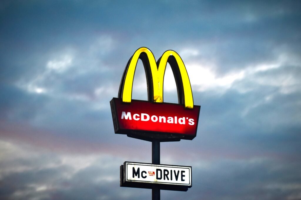
When you think of McDonald’s, one of the first things that comes to mind is the iconic golden arches. The brand design of McDonald’s is a example of how simplicity can create a powerful and lasting identity worldwide.
The Golden Arches are not overly detailed and are clean, and easy to remember with a simple shape and one color. This simple design helps McDonald’s stand out whether you’re driving on a highway or walking through a the city as you can point it out just by finding those golden arches.
Another part of McDonald’s design is its use of color psychology. It uses the colors red and yellow where red is known to grab attention and yellow is associated with happiness and energy. These colors together make the brand feel fast, fun, and inviting. As they serve fast food where the whole idea is the get meals quickly and get as many people in as possible.
Their design follows to their packaging and advertising like the Happy Meal. McDonald’s often uses clean layouts with minimal text and big food images which allow the brand design to speak for itself and grab the audience’s attention. Especially with well know items like the Big Mac where people are able to recognize it instantly even without the rest of the design. As big as a famous fast food place they are, with how they advertised their meals and business, it has grew worldwide recognition.
McDonald’s Brand Identity proves that you don’t need complicated visuals to be successful. By focusing on simplicity, consistency, and strong visual identity, McDonald’s has built a brand that is recognized all over the world.