F1 Logos over the decades
Before we dive into the infamous logos that represented one of the most prestigious motor racing venture known as Formula 1, we must first look at it’s history. Formula 1 launched in the 1950’s and hosted it’s first race on May 13,1950 at Silverstone, United Kingdom and they would evolve over the years to host many races across the world and produce world renowned championship drivers such as Michael Schumacher and Lewis Hamilton.

Introducing the first Formula One logo. This simple, blue logo displaying nothing else but the name was in service from 1950 to 1985. This particular design choice was more for functionality than aesthetic, not causing much of a concern until globalization, commercialism and other trends emerged and F1 decided the wave was not going to pass them by. In 1986, they redesigned the logo.

In the year 1987 the new logo was unveiled and this was a smart move for F1. During this time period, F1 moved into the global sport market. Before then, all of the Grand Prix races was held exclusively in Europe and South America but globalization became a force in the 20th century, grabbing the attention of large companies like Coca-Cola, Marlboro and Mastercard becoming sponsors for the F1 teams. This move gradually spread the Grand Prix geography to Australia, Southeast Asia, the Middle East and North America. This updated logo was switched from blue to black and white, with a race car in the middle of the abbreviations “FIA” which stands for The Fédération Internationale de l’Automobile (International Automobile Federation).
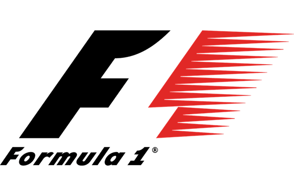
The exclusivity and influence in Europe was gradually declining and F1 adapted quickly, now shifting it’s focus from functionality to it’s ethics and values reflecting in it’s logo, so in 1994 the logotype came out and did this perfectly. This was known as one of the most creative brand of all time, changing from the all black and white to now black, red and white. This redesign came with not just updated colors but they attached meanings. The letter F was in black symbolizing “power”, the color red symbolizing “speed” and “passion”. The white was interspersed between these colors formed the number 1. This served as their logo from 1994 to 2017.
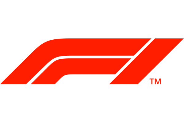
However, the Liberty Media Group took control of F1 and they wasted no time making changes, new rules were formed and at the end of 2017 the new logo was unveiled. This new logo was definitely more modern and also took a nod at simplicity. The sport fans were reportedly not pleased with the changes but as time went by they came to terms and adapted, and those who didn’t took a liking to new hobbies. This logo is still standing to this present day.