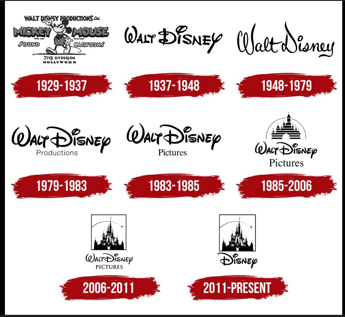
I am a Disney Fan !! First and foremost, there is a large level of appreciation here for the design efforts. Initially, the logo went from just an animation in a studio to becoming a large entertainment phenomenon. In 1934, hundreds of films went on to being produced, showing the success of all Mickey Mouse shorts.
The Initial Design 1929-1937
The design is filled with a lot of detail and quite a bit of typography, with this being true, it is congested. There is a lot to look at, which can confuse you, rather than being a disadvantage. Wanting to be able to get all the info from a logo in just a few seconds can be very helpful.
The Second Design 1937-1948
This logo had some simplicity to it. It is clear with great use of negative and positive space, while allowing the logo to be easy to read.
The Third Design 1948-1979
Still similar, however, there was a slight typography change, and it is cursive. Also, it was slightly harder to read.
The Fourth Design 1972-1983
Has the Walt Disney sign as legible, and with the type for the productions having a slightly different design with different fonts.
The Fifth Design 1983-1985
The sign that is most lovable in my opinion. It changed from San Serif to a serif font.
The Sixth Design 1985-2006
My favorite logo design! It has a bit of everything; it debuted in 1984. The lines that cut into the castle add that detail, and then the arch emphasis. This logo is a good use of negative and positive space. The fact that there is a logo with detail and the castle allows the negative space around it to be built.
The Seventh Design 2006-2011
This one is refined and built towards an older audience. By this point, there was a nice thin line representing a background arch, which is a small but pretty detail.
The Eighth Design 2011- Now
Seeing the logo as this, it is interesting that I have not seen much of the logo with a box around. There is a shooting star now. The font is the same as the castle.
If you do decide to read more about the logo design, visit the Disney fan site!