Nike Swoosh design
The Nike Swoosh design is one of the most famous logos in the world, but it started as a simple student project. Created by Carolyn Davidson in 1971, the logo was designed to represent motion and speed. In this post, we look at how a simple curved line became a global symbol of victory and how it fits into the broader themes of Meaning in the Making.
The Craft Behind the Curve
In 1971, Nike was still a small company called Blue Ribbon Sports. They needed a new identity for their upcoming line of shoes. They asked Carolyn Davidson, a graphic design student, to create a mark that captured the “spirit of motion.”
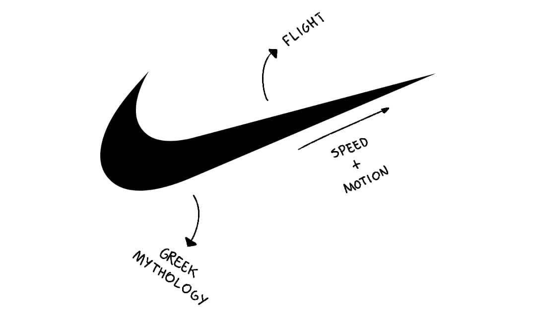
This was a difficult task. The logo had to look good on the side of a shoe, which is a curved and flexible surface. After experimenting with many sketches, Davidson settled on the “Swoosh.” The shape was actually inspired by the wing of the Greek goddess Nike, who represents victory. Much like the Meaning in the Making: The YEEZY Design Philosophy – Meaning in the Making, this shows that even the simplest shapes have deep creative roots.
A Legacy of Brand Identity
At first, Nike co-founder Phil Knight wasn’t sure about the design. He famously said, “I don’t love it, but I think it’ll grow on me.” He chose it because it felt bold and dynamic.
What seemed like a small decision at the time eventually shaped the entire identity of the brand. Today, the Nike Swoosh design is the “gold standard” for brand recognition. Even without the word “Nike” next to it, people everywhere know exactly what the symbol stands for:
- Speed and Agility
- Athletic Success
- High-Quality Gear
Why This Design Works
The story of the Swoosh proves that great design doesn’t have to be expensive or complicated; it just needs a clear goal. Davidson had to make specific choices, like how to curve the line so it flowed with the shape of a leather shoe.
Eventually, the brand became so strong that it removed the text entirely, letting the symbol stand alone. This was a major design decision that proved the symbol had successfully captured the “meaning” of the brand. Every small sketch is a step toward a lasting legacy.