For years, “Eco-friendly” design meant just one thing: making everything green. But in 2026, the audience has grown skeptical. Consumers can spot “Greenwashing” from a mile away. At Meaning in the Making, we’re seeing a shift where brands are using raw, honest design to prove their sustainability rather than just hiding behind a color palette.
Beyond the Color Green
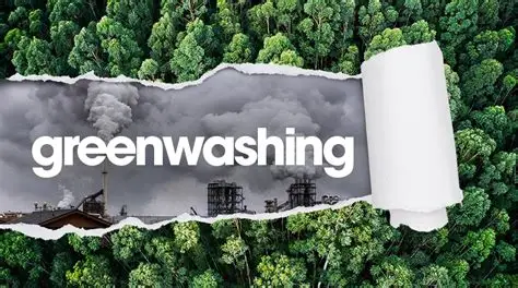
The “Greenwashing Guardrail” is a new trend where designers are moving away from traditional “earth tones” to avoid looking like a cliché. Instead, they are leaning into Transparency Design.
- Raw Textures: We are seeing unbleached paper textures and “ink-saver” typography that uses less pigment.
- The “Why”: It shows the consumer that the brand is prioritizing the planet over a “perfect”, polished look.
The Intentionality of Material
Just as we discussed in our Skittles Intentional Design Case Study, every physical choice carries weight. In eco-branding, the “Meaning” is found in the reduction. By removing plastic coatings or using soy-based inks, a brand tells a story of responsibility. This is a specialized form of Color Hunting, where we search for the most natural, least processed hues in the environment.
Trust as a Design Element
In an era of skepticism, simplicity equals honesty. Much like the Heritage Branding shift we saw with Burberry, eco-brands are stripping away the “marketing fluff.” They are using bold, clear typefaces and “exposed” packaging to show they have nothing to hide.
Final Take
Eco-branding in 2026 isn’t a style; it’s a commitment. When the design is as sustainable as the product, the brand stops selling a “look” and starts building a legacy of trust.