When you see a red bag with a curved spectrum of colors, your brain immediately registers a specific experience. But the “Why” behind their design goes much deeper than just being colorful. At Meaning in the Making, we deconstruct how Skittles uses visual psychology to create a brand you can almost taste.
The Power of the “S”: Typography as a Signature
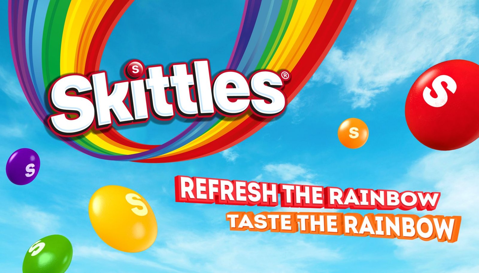
The Skittles logo is anchored by a bubbly, rounded typeface that feels approachable. However, the real genius is the lowercase “s” printed on every individual candy.
Why the “S” Matters
- Authenticity: That “s” is a mark of quality. It tells the consumer they are eating the original, not a generic imitation.
- Tactile Identity: The “s” isn’t just a label; it’s an integrated part of the candy’s identity. Much like the Beskar-inspired textures in the Mandalorian logo, this small detail makes the product feel “forged” and intentional.
Color Curation: Creating a Visual Index
Skittles doesn’t just use random colors; they use a specific high-saturation palette designed to trigger a physical “mouth-watering” response. This is a professional application of the 2026 Color Hunting trend—where every hue is curated to evoke a specific emotional reaction.
The Contrast Strategy
The bright, multi-colored lentils are always set against a deep, vibrant red background.
- The “Why”: Red is the color of appetite and urgency. By placing the “Rainbow” against a red canvas, the brand creates high-contrast visuals that pop on crowded store shelves.
The Shift to Minimalism
In recent years, Skittles has simplified its packaging, removing 3D effects for a flatter, “Neo-Minimalist” look.
- The Goal: This aligns with the larger movement toward Heritage Branding and authority. Skittles is now confident enough in its visual “Rainbow” that it no longer needs flashy effects to be recognized.