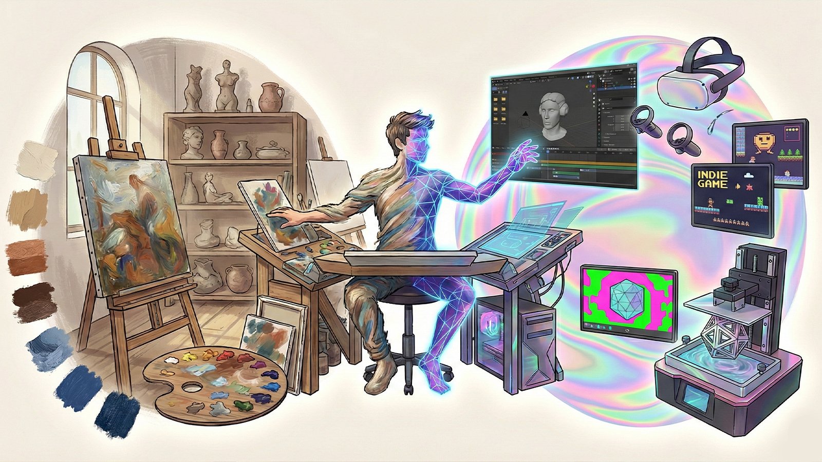
Texture Check: Why Tactile Design Trends are Viral in 2026
If you’ve scrolled through your feed this week, you’ve likely seen the “Texture Check” trend. Designers are ditching flat, boring buttons for 3D shapes that look like glass, wax, or soft plastic. This shift toward tactile design trends is a creative rebellion against the “too-perfect” look of AI. At Meaning in the Making, we see this as a return to valuing the physical craft behind the digital screen.
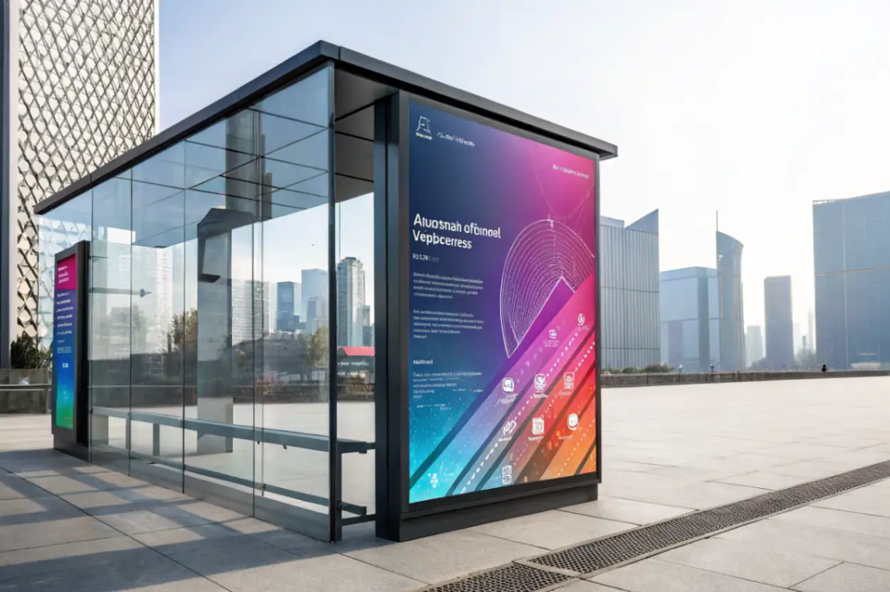
The Rise of “Liquid Glass” and 3D Puff
One of the main drivers of this trend is the new “Liquid Glass” UI. Instead of flat icons, your phone screen now looks like it’s made of depth and layers. Brands are also using “puffy” or squishy-looking typography that feels like it has physical weight.
This isn’t just for show. As we discussed in our Meaning in the Making: The YEEZY Design Philosophy – Meaning in the Making, the materials a creator chooses change how we feel about a product. When a digital button looks “squishy,” it feels more playful and approachable than a flat, cold rectangle.
Why We Want to “Touch” the Screen
Why is this happening now? In 2026, we spend so much time in digital environments that we are starting to miss the feel of real-world materials. By using textures such as crumpled paper, grainy sand, or smooth chrome, designers aim to make our apps feel more like “real” objects.
This push for imperfection is exactly what we covered in our look at Why “2026 Is the New 2016” Is a Trending Creative Movement – Meaning in the Making]. Just like people miss the raw feel of 2016 social media, they now miss the feeling of handmade objects. Tactile design makes a brand feel like it was “crafted” by a person, not just generated by an algorithm.
Lessons for Modern Brands
- Add Depth: Don’t be afraid to use shadows and layers to make your website feel 3D.
- Use Sensory Language: Even if you can’t literally touch the screen, your eyes can “feel” texture. Use grainy or waxy finishes to stand out.
- Human over Machine: The more a design looks “touched” by a human hand, the more your audience will trust it. This connects back to the core mission of Belonging by Design: Breaking Down the Airbnb Design Process – Meaning in the Making—designing for human belonging.
Final Take
The “Texture Check” movement proves that we are moving into a more sensory era of design. It’s no longer enough for a brand to just look good; it has to feel real. By embracing tactile design trends, we put the “Making” back into our creative process.