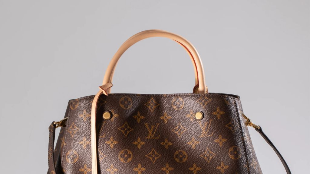
When you see the interlocking “LV” on a deep chocolate background, you aren’t just looking at a color choice; you’re looking at a security feature that became a status symbol.
A War Against Counterfeits
In the late 19th century, Louis Vuitton’s success was his biggest problem. Everyone was copying his revolutionary flat-topped trunks. To stay ahead, his son, Georges Vuitton, needed a design so intricate it would be nearly impossible to replicate by hand. In 1896, he created the Monogram Canvas—a complex pattern of flowers, quatrefoils, and his father’s initials.
Why Brown and Gold?
The choice of the iconic brown and gold (technically a beige or “light amber” on a dark brown base) was a masterclass in intentional design:
Continuity: The colors were carried over from the earlier Damier (checkerboard) pattern to maintain brand recognition while upgrading the complexity.
Practicality for Travel: These “earth tones” were incredibly functional for the rugged era of steamships and trains. The dark brown hid the scuffs, soot, and dirt of travel, while the gold-toned motifs added a layer of visible luxury that “popped” against the dark background.
A Symbol of Wealth: At the time, deep browns and rich golds mirrored the high-end leather and wood finishes of the world’s elite.
The Legacy
What started as a way to protect the brand ended up defining it. The palette was inspired by the Victorian obsession with Japanese Art Nouveau and Gothic motifs, turning a “security pattern” into a global language of sophistication.
Next time you see that brown canvas, remember: it wasn’t just designed to look good—it was designed to be uniquely Louis Vuitton.