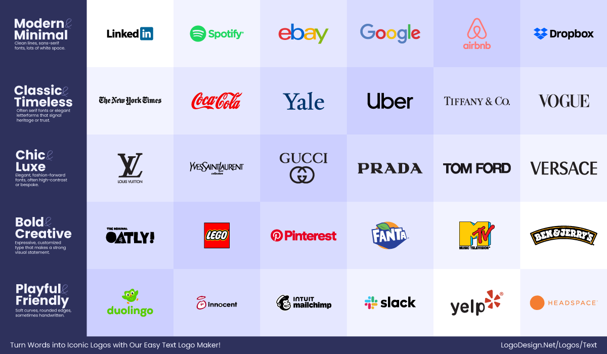
The Return of the Serif: Why Minimalist Branding is Changing
For the last ten years, minimalist branding has been the dominant style. Tech giants like Google and Airbnb led the way with flat, simple logos designed to look clear on smartphone screens. However, this “clean” look eventually made every brand look the same. In this post, we explore how using serif fonts in branding is helping companies stand out again, connecting back to our mission at [link to your Meaning in the Making pillar page].
Why Serif Fonts Matter
Many designers now feel that hyper-simple logos look too much like cold tech startups. They often lose the special feeling of history and craft. To fix this, brands are bringing back serif fonts—the ones with small “feet” at the ends of the letters.
These small details make a logo feel more human and less like a machine-made one. In a digital world, these “feet” resemble pen strokes or marks from a hand tool. This shift is a perfect example of the “craft” we discuss in our The Secret History of the Nike Swoosh Design – Meaning in the Making, where every line has a specific purpose.
Choosing Personality Over Simplicity
Burberry is a great example of this change. After years of using a blocky, simple font, they recently returned to an old-school serif look and brought back their classic knight logo. They aren’t alone; even Johnson & Johnson recently updated their look to balance modern style with their famous history.
People still crave designs that look like a human signature or a hand-drawn mark. According to branding experts at Search Engine Land, “freshness” and a unique identity are the keys to staying relevant in 2026.
Putting the Meaning Back in Design
Top companies now realize that a brand needs a “soul” to survive. By moving away from generic shapes and choosing better fonts, they are putting meaning back into their work. This trend shows that brands should remember their roots, even in a digital world.
As I noted in my Meaning in the Making: The YEEZY Design Philosophy – Meaning in the Making, the materials and shapes we choose tell a story. Whether it is a sneaker or a font, we must value the craft that goes into every single letter.